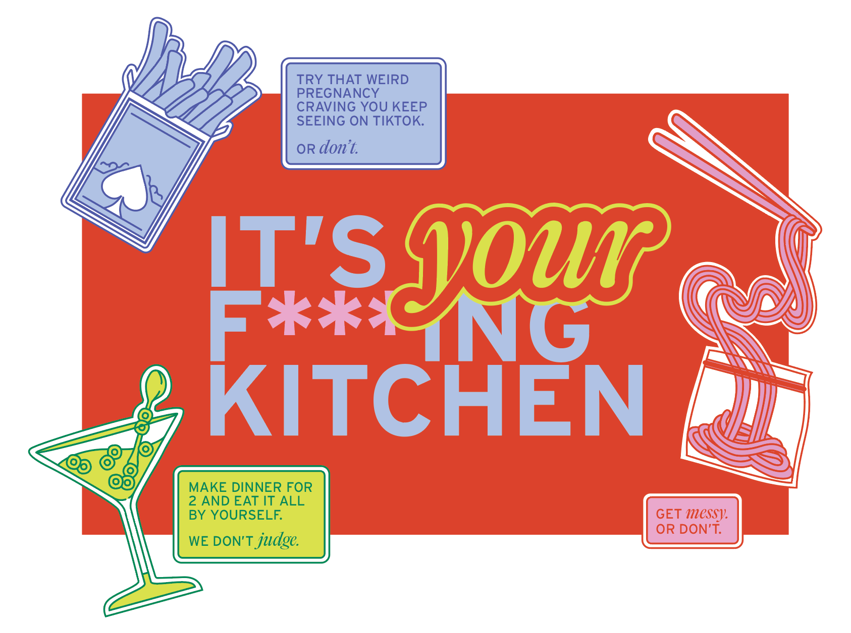
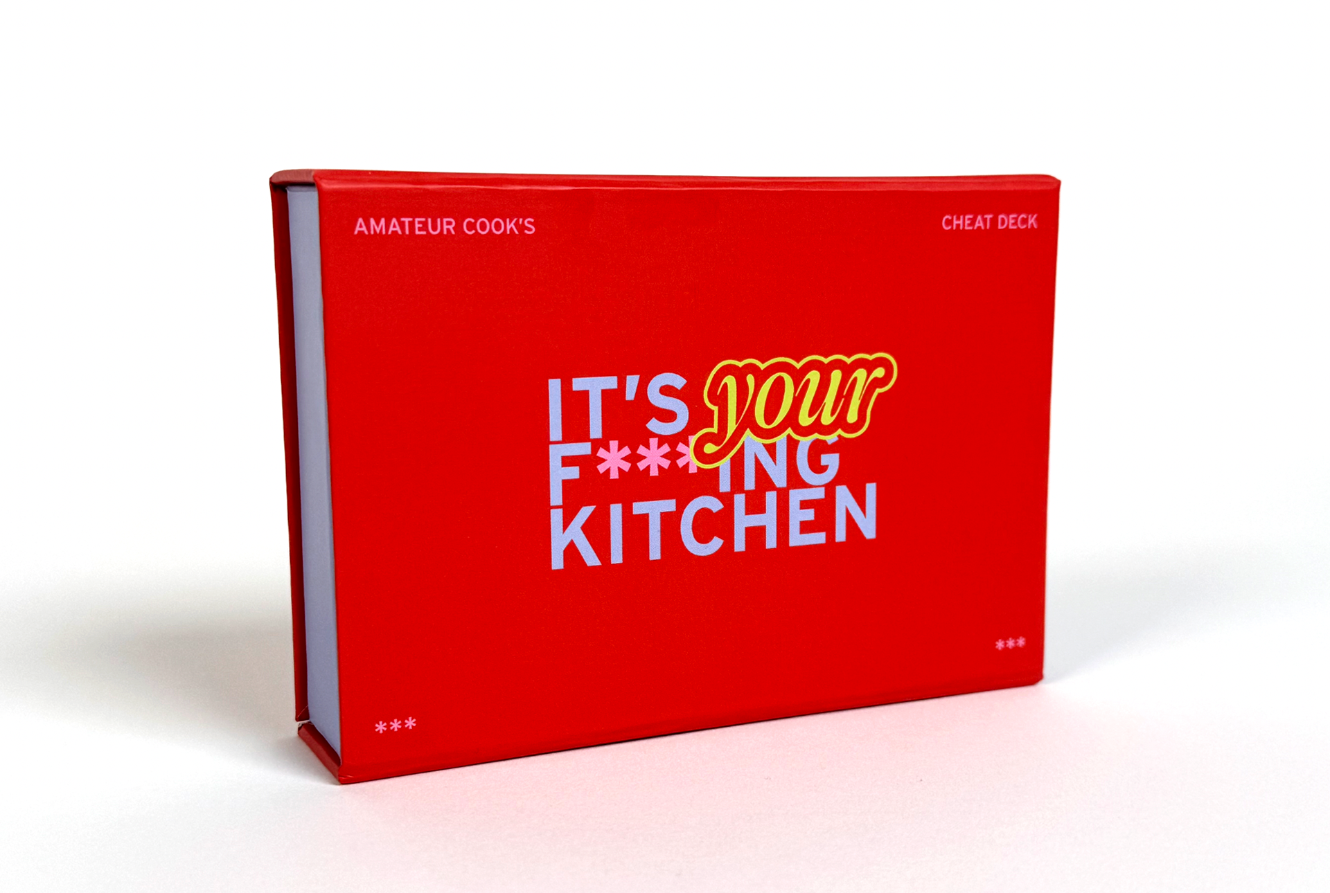
Inspired by a lack of enthusiasm for home cooking within younger generations, It’s Your F***ing Kitchen is a guide for stimulating ideas and promoting learning (by doing) in the kitchen. Use it as a game and quiz yourself, or use it as an idea bank for inspiration while you make dinner. Each card contains useful info, tips, tricks, and questions to help you build your next meal and become a more confident cook. Get messy, go crazy. Or don't. (It's your kitchen).
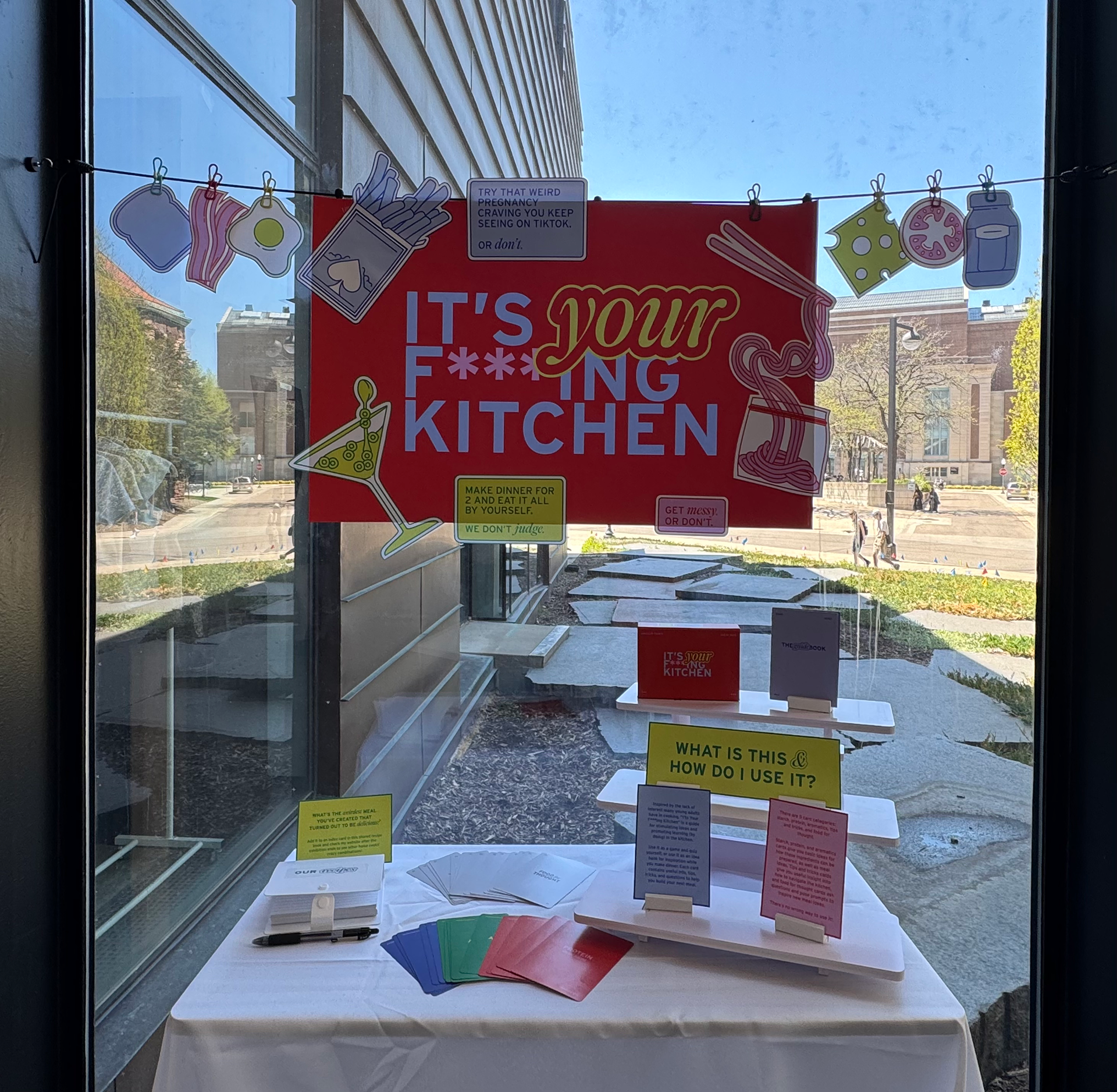
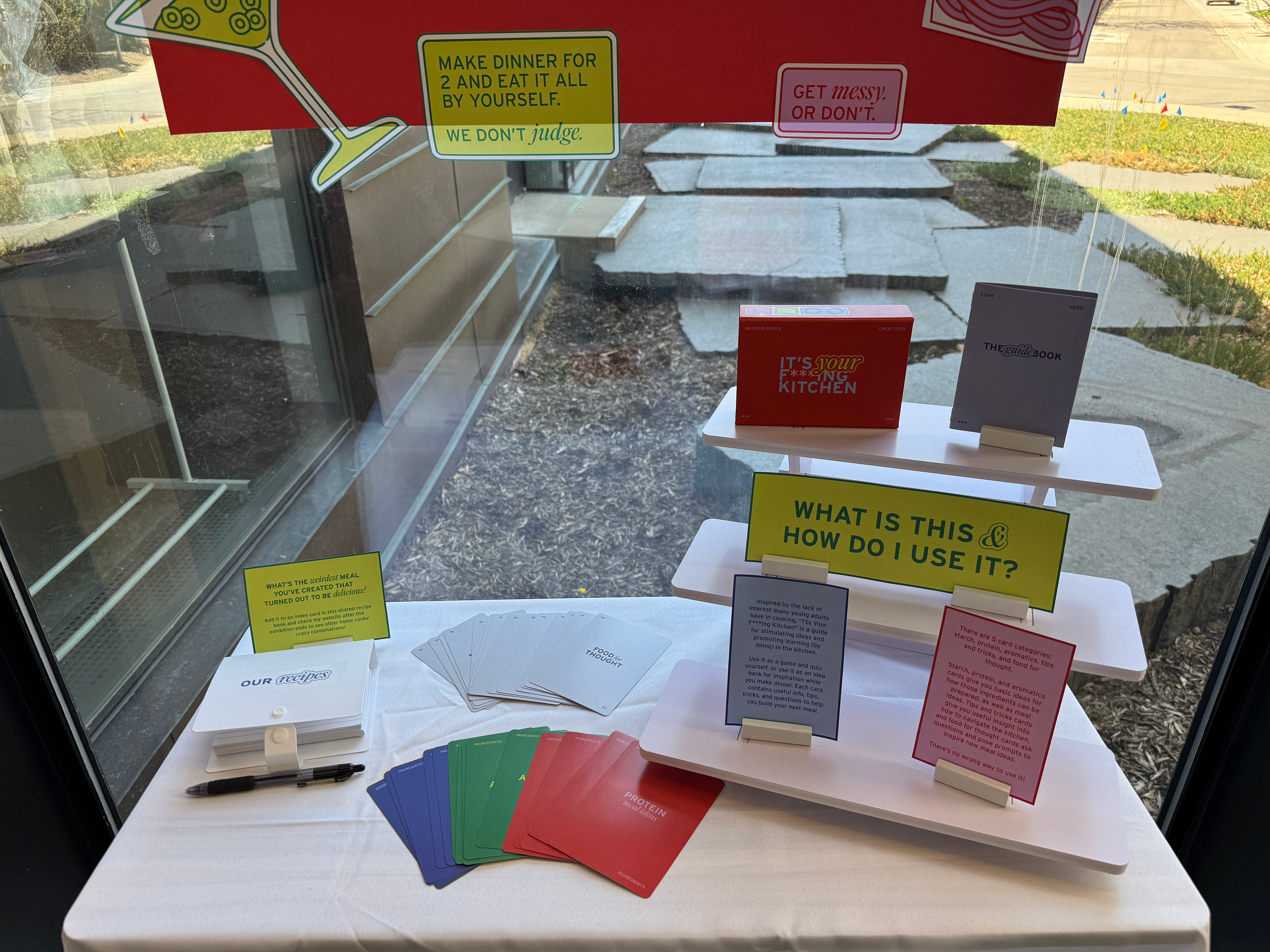
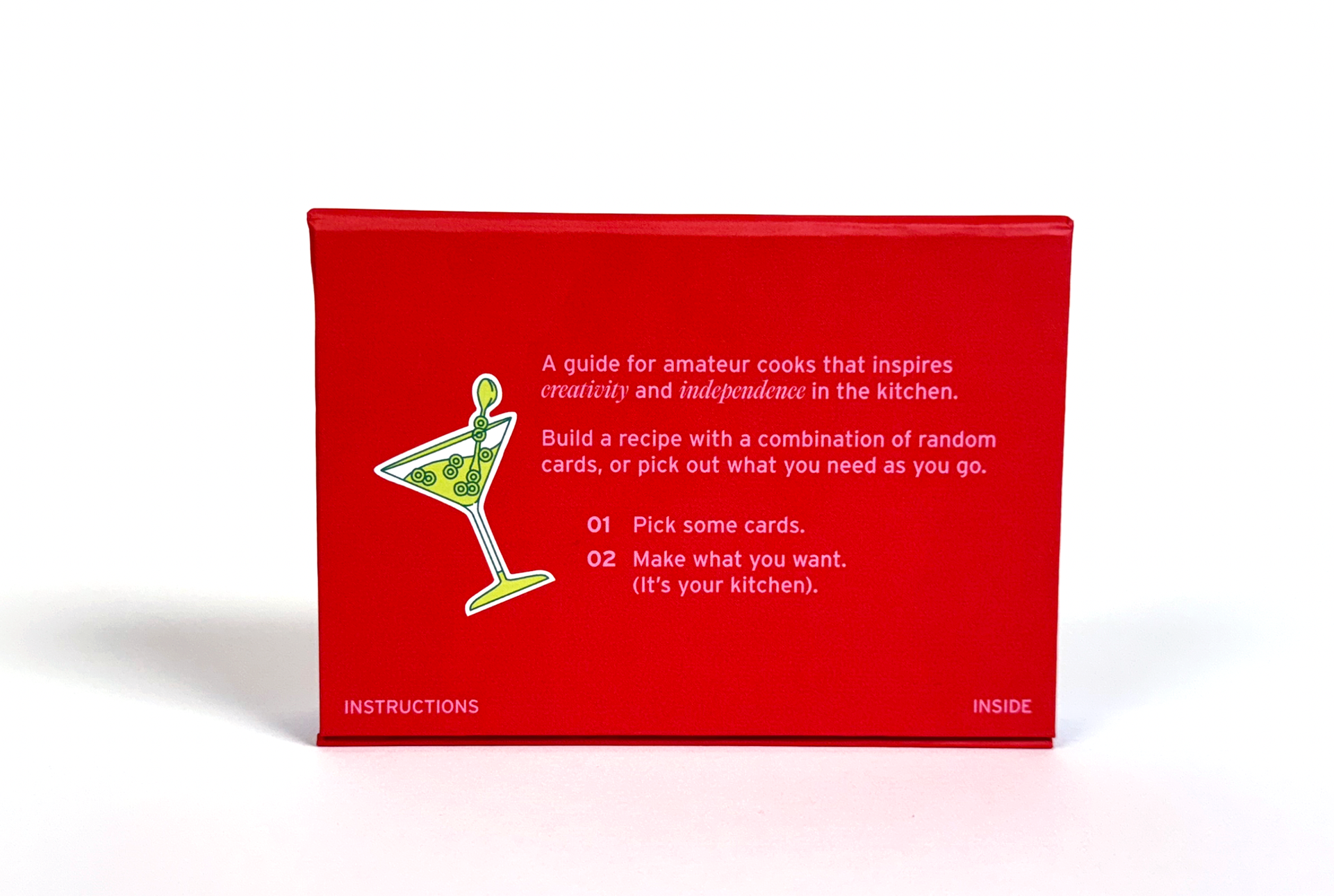
Final deliverables include a box, 30 cards, an introduction booklet, and illustrative elements for the exhibition display.
INSPIRATION & BACKGROUND
Only about 49% of American families consistently cook dinner at home. That’s not a huge surprise; cooking quickly starts to feel like a chore when we're surrounded by much easier options that fit our constraints (meal delivery services, fast-food, frozen meals, etc). Cooking as a skill isn't necessary for survival anymore, but it does have countless benefits for your physical and mental health, as well as helps friends and families create long-lasting memories. Because my generation grew up in this age of instant access to food, many of us don't see the need to learn much (if anything) about cooking, despite those benefits. I wanted to address this issue by creating a more engaging way for young adults to learn culinary skills and become confident in the kitchen, instead of simply following recipe after recipe.

HOW THE CARDS WORK
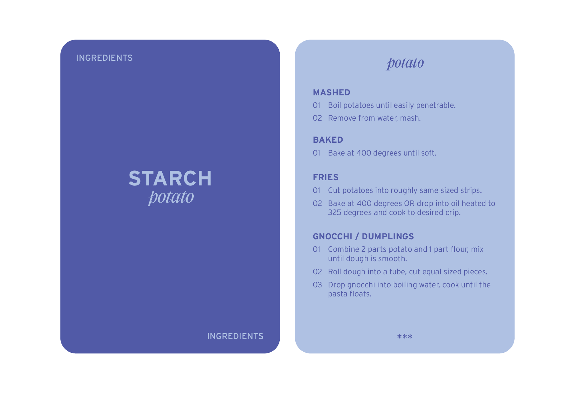
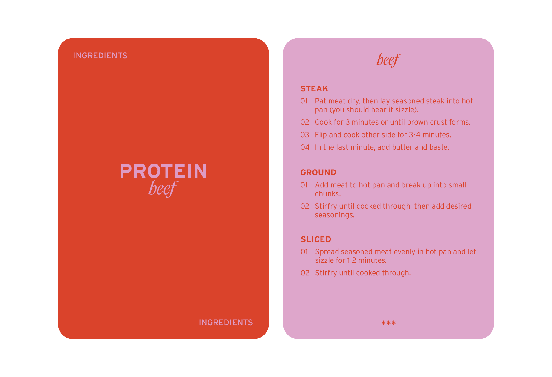
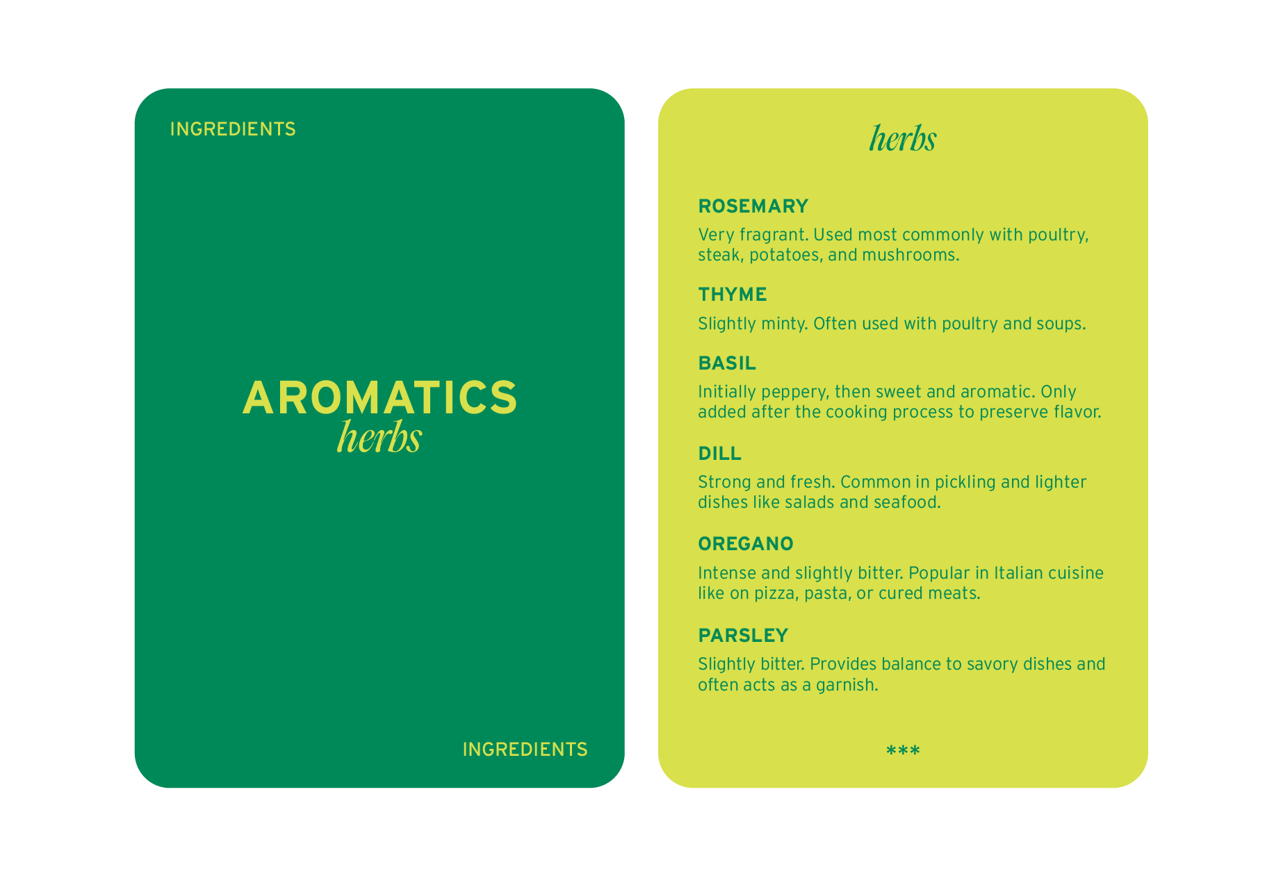
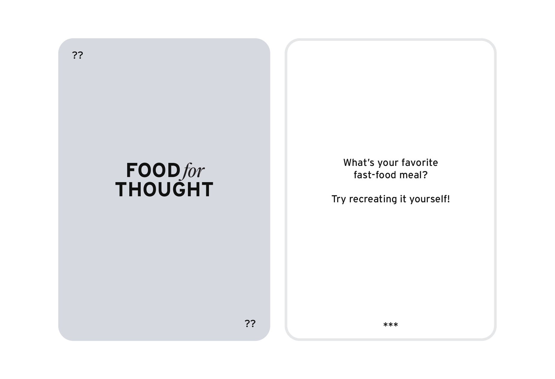
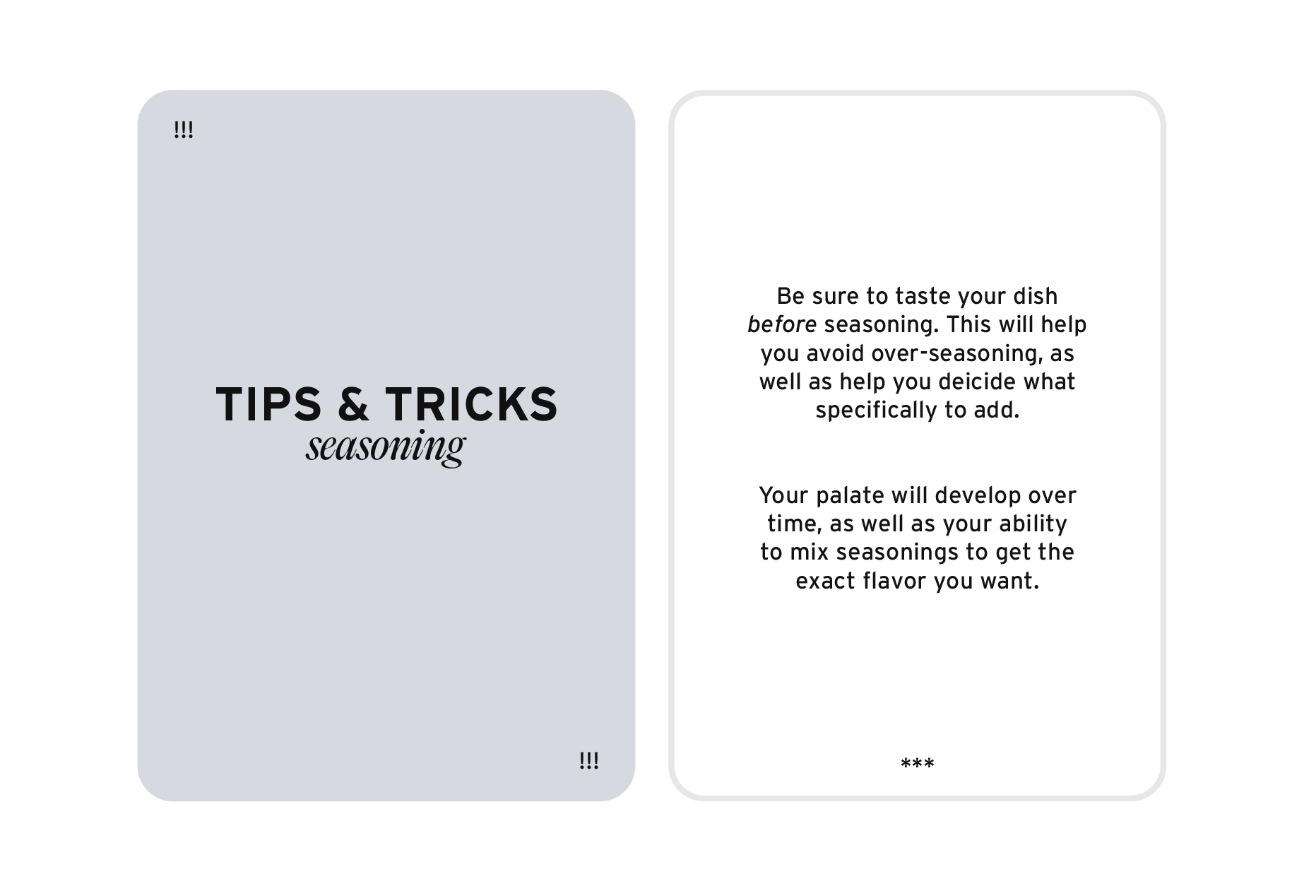
There are 5 card categories: starch, protein, aromatics, tips and tricks, and food for thought. Ingredient cards, like the starch, protein, and aromatics, give you basic ideas for how those ingredients can be prepared, as well as meal ideas. Tips and tricks cards give you useful insight into how to navigate the kitchen, and food for thought cards ask questions and give you prompts to inspire new meal ideas. There's no one, strict way to utilize the cards; they simply work as helpful tools that you can choose to use while building your own recipe. You might also choose to pick a card from each category and see what kind of meal you can come up with!
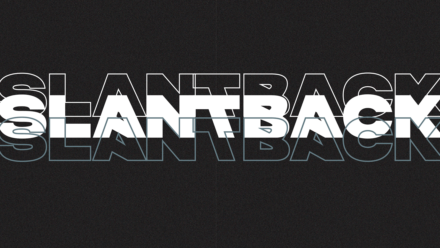
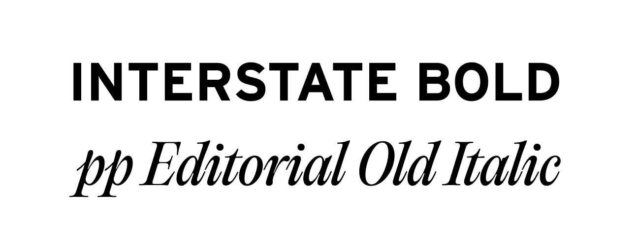
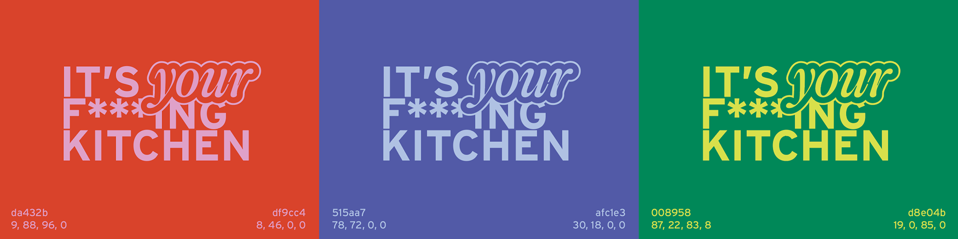
CREATIVE DIRECTION
I wanted to grab my generation’s attention through bold color, funky visuals, and a healthy dose of aggression. The color palette was designed with specific card categories in mind - starch (blue), protein (red/pink), and aromatics (green) - while the red was chosen to act as the primary color to push the confident (and slightly brash) nature of the brand. Interstate bold reenforces that confidence, and pp Editorial Old italic represents the creativity and flexibility you'll soon have in the kitchen.
I was heavily inspired by the simple fact that we all have the free will and autonomy to be creative, even if it doesn’t turn out to be perfect. The brand name is also the main message: it's your kitchen, so you should take advantage of the freedom you have to learn and create things that you're excited about. It could be weird or imperfect, but it's never wrong. The illustrations I created for the brand enforce this funky narrative - noodles in a ziplock bag, fries in a card box, and cereal in a martini glass.
EXHIBIT SETUP
This project was displayed as an exhibit over the course of a few weeks. The exhibit included the final box and cards, instruction manual, illustrative poster elements, and a small interactive element that invited people to contribute to a shared recipe book with their weirdest (but delicious) recipes.